[18+ Board] - [YP Home] - [Project Status] - [YP Wiki] - [Burichan] [Futaba] [Gurochan] [Photon] - [Home] [Manage]

[Return]
Posting mode: Reply
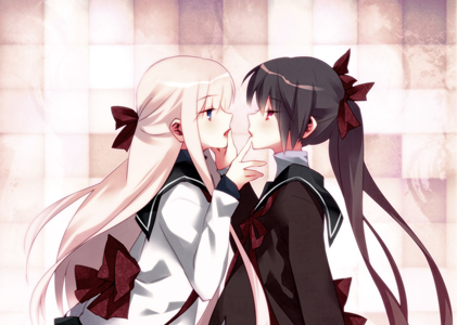
File: campanula_of_the_library_01.png -(3297710 B, 1790x2551) Thumbnail displayed, click image for full size.
3297710 No.10977  

24 pages
http://www.mediafire.com/download/22b4i36c3gn15g2

>> No.26002  
File: Campanula of The Library.txt -(9971 B, 0x0) Thumbnail displayed, click image for full size.

If I had only waited a couple more weeks to post this, it could have been a ten year old project. Content warning: old school raws, jumping out of windows not like that, old school GL ending.

>> No.26913  

I'll edit this

>> No.26914  

Wootie!

>> No.26926  

https://drive.google.com/drive/folders/1vdN05AxHJ160RSmb65kC68u76p-34GPg?usp=sharing

Untranslated SFX/text:

  • page 8, panel 2: there's 2 of them here
  • page 9, panel 3
  • page 15, last panel: above the "please" bubble
>> No.26927  

I feel so heartbroken… you can’t do this to me 😭

02/3: “What are you talking about!” looks weird without a question mark – maybe use ?! or !?
03/4: The comma after “But” is unnatural, I don’t think there would be a pause there in speech (but that might just be me)
05/3: “T-” → “Th-”
07/2: Not sure about the font used for “I love it ♡”, it doesn’t look very handwritten
07/5: “let’s" → “lets”
08/2: Add a white glow (or border) around “This is the 2nd floor!”, it’s a bit hard to read right now
08/3: Just a personal preference, but I think it might be nice to split “WHOOSH” up as “WHOO” / “OSH” so both the parts of the JP SFX look translated
08/5: Question mark on the next line
11/1: Another case where a glow or border would help readability
11/6: same as above. Also, the redrawing looks a bit off, if you could darken it slightly
12/5: “flap” should be slightly higher, just so the bubble doesn’t look so lopsided
13/3: The “Um”s look a bit weird just floating, I’d suggest “Um…"
>> No.26928  

>>26927

> 08/5: Question mark on the next line

Is this the ninja bubble? Did you want me to put the question mark up on the previous line?

> 12/5: “flap” should be slightly higher, just so the bubble doesn’t look so lopsided

It's like this in the original. Do you still want me to center it?

>> No.26929  

08/5 is fine actually – if it’s intentional, keep it.

> > 12/5: “flap” should be slightly higher, just so the bubble doesn’t look so lopsided
> It's like this in the original. Do you still want me to center it?

Right, just that to my eyes it looked slightly more lopsided than the original; it should still be uncentered. But it’s also not a big deal.

>> No.26930  
File: sample.png -(90647 B, 384x344) Thumbnail displayed, click image for full size.
90647

>>26929

> 08/5 is fine actually – if it’s intentional, keep it.

Yea, it was intentional. Otherwise, it would fit the bubble weird. But see the attached image for side-by-side differences.

> Right, just that to my eyes it looked slightly more lopsided than the original; it should still be uncentered. But it’s also not a big deal.

I straightened it slightly and moved it up. Let me know what you think.

>> No.26931  

all good!

>> No.26938  

>>26926

page 8, panel 2: Hop and My soul...
page 9, panel 3: Whisper
page 15, last panel: Sniff

>> No.26940  

>>26938

Thanks! Link updated

>> No.26967  

Fixed typos and whatnot that were mentioned in the dynasty server

>> No.26968  

Woo! Thanks for the great work, everyone!


Delete Post []
Password